Minnesota Association for Marriage and Family Therapy
Challenge
The Minnesota Association for Marriage and Family Therapy approached us to evaluate the usability of its website, and identify key opportunities for improving the experience of current members, potential members, and the public.
Solution
After synthesizing findings from group research and usability testing, I prepared a findings and recommendations report that targets issues involving the site interface, hierarchy, clarity, and demonstration of value to robustly align the association’s digital arm with their primary goals.
Methodology
Heuristic Analysis
In-Person & Remote Usability Testing
Affinity Diagramming
Findings & Recommendations Report
The Client
Get to Know MAMFT
The Minnesota Association for Marriage and Family Therapy is a non-profit organization that serves as the professional home for Marriage and Family Therapists (MFTs) in Minnesota.
MAMFT exists to promote and protect the well-being of families, couples, and individuals through the advancement of the profession and practice of marriage and family therapy in the state of Minnesota. The organization does this through engaging in advocacy (legislative and policy), providing affordable and quality training, facilitating networking opportunities, and offering other professional resources for MFTs looking to advance their practice. Looking to the future, MAMFT is interested in broadening this scope and becoming more inclusive and visible to the public sector, along with increasing organizational transparency around the work of their board members.
Relationships Matter. MAMFT provides professional support, resources and advocacy to marriage and family therapists while serving as the vital source of relational therapy within the community.
MAMFT Mission
Who are the users?
Current Members looking for resources and to get the value out of their membership
Potential members looking for resources and wanting to see the value of a membership
Affiliate members and the public looking for information on Marriage and Family Therapy and healthy relationships
What are the site goals?
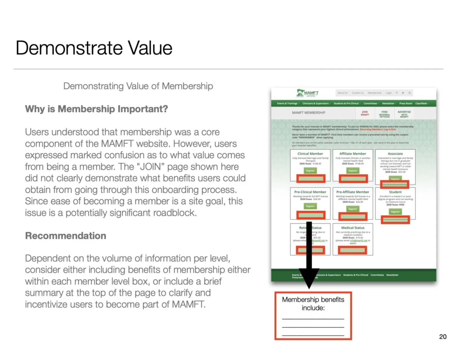
Demonstrate the value of membership
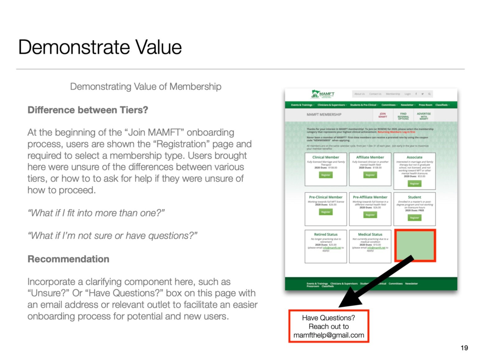
Encourage and support easy membership enrollment
Facilitate event registration easily and quickly
Provide practice-based resources
RESEARCHING THE PROBLEM SPACE
To deepen my understanding of the website and put ourselves in the shoes of MAMFT’s users, I conducted a usability review with Schneiderman’s 8 Golden Rules for Interface Design.
These initial observations surfaced that while MAMFT was committed to meeting users’ needs - offering features that directly supported their core tenets of facilitating professional support, providing resources, and engaging in advocacy - there were 3 primary usability roadblocks that could hinder user follow-through on the site:
#1
Navigating the site was time-consuming due to a lack of clear and concise language and write-in form fields. Pages were filled with content, but lacked hierarchical structure, clarity, and efficiency for users.
#2
While finding the “Join MAMFT” registration page was easy, it was unclear why joining would be beneficial. What specifically is the value of paying to become a member? What benefits are available to members vs non-members? What are the differences in benefits between levels of membership? Missing contextual information motivating potential members to join.
#3
It was difficult to identify how to connect with other members. The member directory, a tool that affords users the opportunity to connect with other members, was not accessible.
USABILITY TESTING
With a more well-rounded understanding of the website and our hypotheses for various opportunity spaces in mind, the team came back together to define our collective research goals, tasks, and scenarios needed for our usability tests:
Gain insight into the perceived utility of the site
Gain insights as to the perceived quality of the primary function
Evaluate the usability of primary tasks
Identify general areas of confusion/clarity that could be further enhanced
We performed 15 audio/video/screen-recorded usability tests: 5 in-person sessions (20 min) at Fathom Consulting, and 10 remote sessions (45-60 min.) Participants were guided through various tasks, framed within the scenario of being a non-member and then later as a registered member.
SYNTHESIZE AND SIMPLIFY
After testing, my team began externalizing and synthesizing our observations onto a whiteboard, before taking it digital and further affinity diagramming in Trello.
From these observations, several themes started to emerge around credibility, clarity, and intent/value:
DEMONSTRATING VALUE to define intent and motivate
While users generally were able to successfully identify what opportunities or features were available to them, many users struggled with why a task was important, and in some cases, how to go about doing it.
HIERARCHY & NAVIGATION to provide clarity
A majority of participants were easily able to identify the professional services available to site visitors. However, a majority of these same participants were unable to efficiently or confidently follow-through on several of these services. Users often weren’t sure where to go to accomplish a task, or were confused about whether they were in the right spot after trial-and-error navigating.
USER INTERFACE/VISUALS to increase credibility
Several negative user observations often overlapped on elements that either seemed out of place, inconsistent with their mental model for what should happen or appear, or were found to be difficult to read. Interestingly, encountering these types of issues often resulted in users making overarching takeaways alluding to the credibility, authenticity, or relevance of the site. It became clear that targeted improvements on these issues would contribute to overall feelings of trust towards the application and organization.
Several of the usability problems that we discovered directly conflicted with the core site goals of the organization, particularly in reference to their online resources and networking opportunities. Keeping in mind MAMFT’s goals and mission statement, Relationships Matter, I prepared a recommendations and findings report that prioritizes the realignment of their digital arm with their core values, and well as better supports the core needs of their users.
CONCLUSION
MAMFT is well on its way to being an incredibly robust and engaging resource for its members and staff.
Incorporating targeted improvements to the user interface/visuals, hierarchy and navigation, along with clearer communication of values will dramatically increase the site’s basic usability and adherence to its own mission that Relationships Matter, affording MAMFT a stronger foundation on which to begin supporting their long-term digital expansion goals.


