We Can Ride
Challenge
Work with local nonprofit We Can Ride to evaluate and redesign key flows within their web application to creatively facilitate greater engagement for potential/current users, more effectively communicate the organization’s value and mission, and advance their visual presentation.
Solution
An interactive prototype that designs for good - leveraging behavioral economics principles and the unique needs of its essential users - volunteers and donors - to provide the bone structure of an emotive, engaging, and informative new design reflective of We Can Ride’s evolved brand identity.
Methodology
Client Interviews
Secondary Research
Competitive Audit
Card Sorting
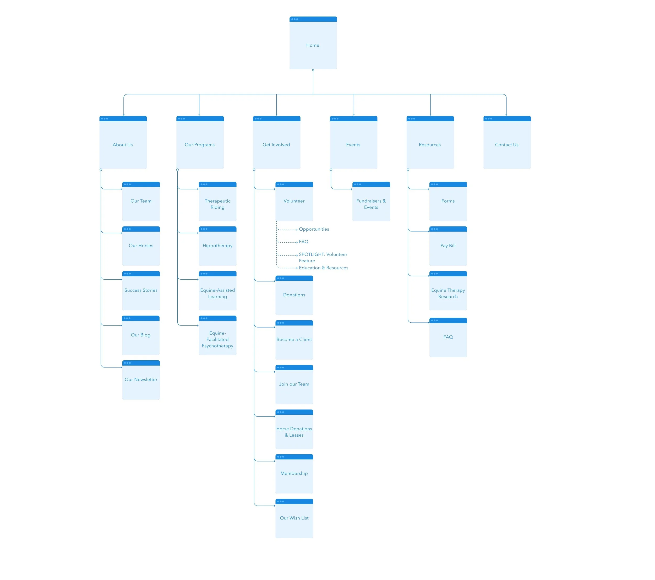
Site Map (Sketch)
Survey
Generative User Interviews
Usability Testing
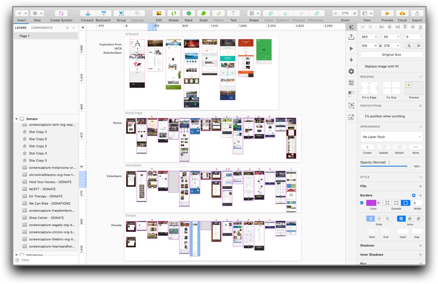
Wireframing (Sketch)
Interactive Prototype (Invision)
Annotated Wireframes (Keynote)
The Client
Get to know We Can Ride
We Can Ride is a volunteer-based Minnesota nonprofit whose mission is to improve the lives of individuals with disabilities or special needs through equine-assisted activities and therapy. Since opening in 1982, We Can Ride has grown into an incredibly impactful and beloved part of their community. They are run by a small but mighty staff, rooted in the ethos of teamwork and a culture of family. They currently have 500+ volunteers, 18 horses, and have helped more than 6,000 families across 8 counties. While their staff may be small, their impact is anything but.
Like many nonprofits, We Can Ride charges its riders a fraction of the cost required to operate, to ensure that they are able to help as many riders as possible, regardless of financial ability. This is somewhere in the neighborhood of just 25% of their total operational costs. As a result, their continued success is attributed in large part to their generous network of volunteers sharing their time, and donors supporting their fundraising efforts.
At the time of this project, We Can Ride was in the midst of a rebranding effort. They wanted to take this opportunity to redesign the website to better communicate their story, find opportunities to support their current users, as well as grow their organization.
RESEARCHING THE PROBLEM SPACE
Discovery research kicked off with a client interview, where I met several We Can Ride staff members and gained a deep understanding about how the organization functioned, how they’re helping the community, and what was needed from a redesign.
Client kickoff meeting
Reflecting on this meeting, I decided the new web application needed to work as hard as they were at powering their mission, and serve as a centralized hub that could help facilitate the volunteer and donor engagement they needed to do so.
Because We Can Ride was pursuing a total redesign, I needed to start my research from the ground up. One of the reasons I was drawn to their organization was my experience working as a nonprofit volunteer when I lived in Chicago. I was somewhat familiar with nonprofit work from that perspective, but needed to take a closer look at the digital landscape to get a sense for what the current best practices were, and what comparator nonprofits were doing in the same space. I conducted a competitive audit, content inventory of the site, and dove into secondary research.
At the same time, I created survey questions for users and prepared an open card sort exercise to find ways of making the existing navigation more intuitive. I also learned in-depth about the application of behavioral economics, to later maximize the effectiveness of my future design:
Social Proof/Herd Effect
Recognition
Default Bias
Anchoring
Scope Sensitivity
Reciprocity
Loss Aversion
Singularity Effect/Identifiable Victim Effect
NAVIGATING ROADBLOCKS
A challenge that I ran into early on was the distance from which I had to get to know this very in-person-based organization. Due to the stay-at-home mandate, it wasn’t possible to visit the We Can Ride site and observe the various workflows, see the volunteer community interact with each other/riders/staff, or talk directly with their supporters onsite. Because I couldn’t get boots on the ground, I adapted and relied heavily on the above research, feedback from fellow UXers, as well as several remote interviews with volunteers and donors to develop my initial understanding of We Can Ride as an organization and their users’ values, motivations, and pain points.
MEETING THE SUPPORTERS
Several of the same needs began bubbling to the surface as I conducted more remote interviews and surveys. Donors needed to have a specific set of questions addressed before they felt comfortable donating online:
What is their mission? The value of their work?
Are they effective? Credible?
Who are they helping?
Where can I learn more about equine therapy?
Is it easy to donate?
Will my donation make an impact?
As for volunteers, it was important for them to feel valued by the organization, and see their community represented online in a proportional way. They especially wanted to see more recreational and educational content:
More consistent new photos, videos, and celebrations of volunteer work that they could confidently share with friends and family.
More easily accessible resources to build upon their initial training, reinforce their skill sets, and learn more about the therapy itself.
Both user groups also emphasized an overwhelming desire to see more of the horses, aka the “muscles behind the miracles”. Many current volunteers were initially drawn to work at the organization by a love of horses, so showcasing these 4-legged staff was a must in the redesign.
KEEPING WHAT WORKS
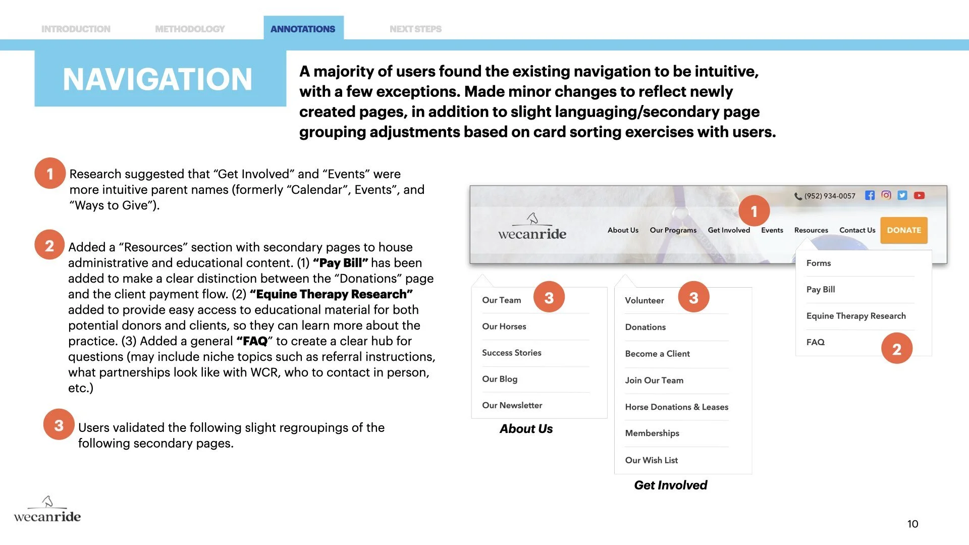
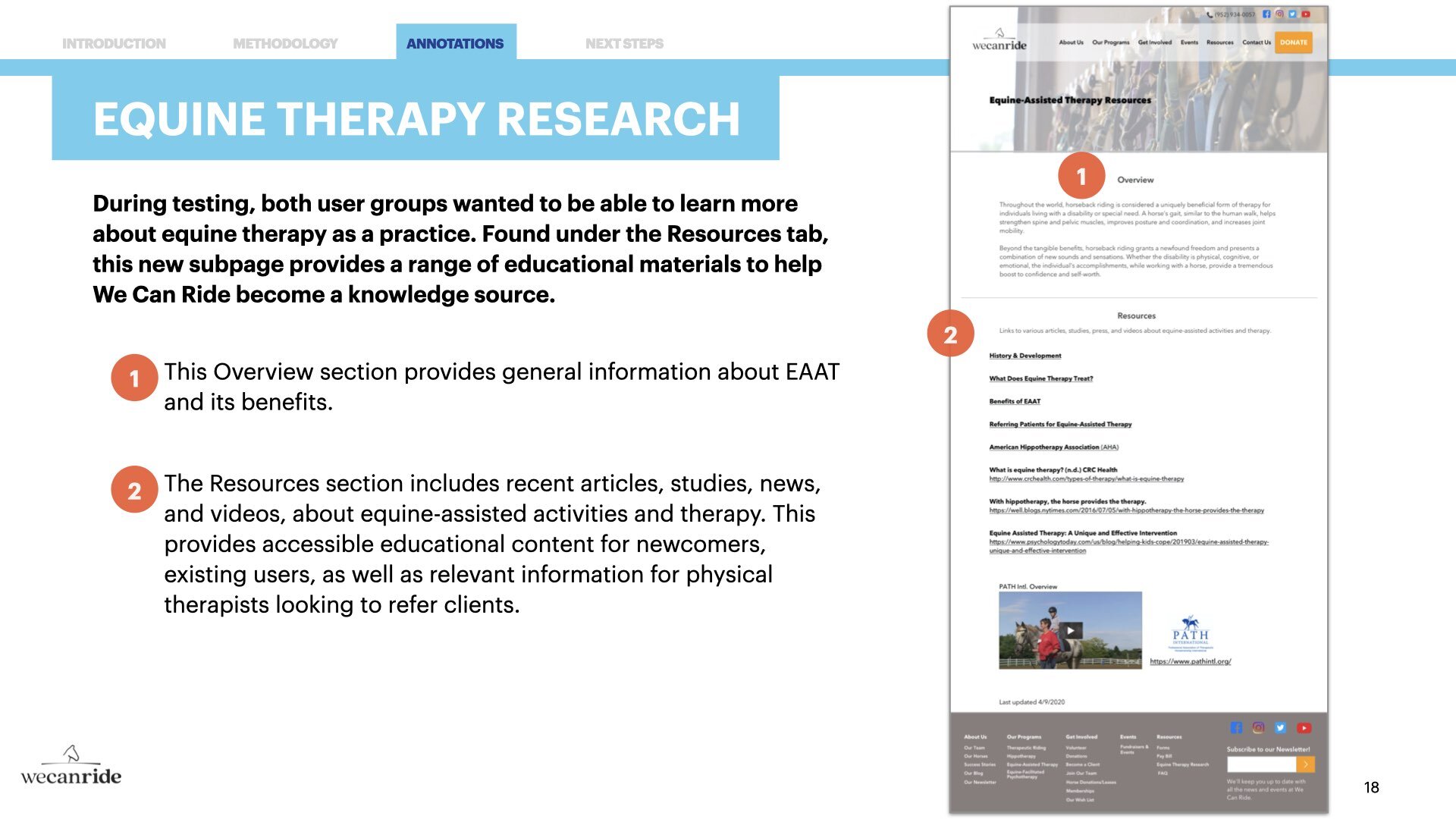
From the card sorting exercises in Optimal Workshop, I gleaned insights into how to revise the existing parent and child navigation, as well as how best to incorporate new pages. Analytics showed that a majority of users found the existing header and groupings to be mostly intuitive, with few exceptions. No need to break what isn’t broken, so I only applied moderate changes here to help facilitate easier discoverability of high-value content for users. Most notably, I added a new “Resources” section to house more administrative subpages, such as “Pay Bill”, “Forms”, “FAQ”, and “Equine Therapy Research” (providing educational resources on the therapeutic practice).
PROTOTYPING THE REDESIGN
Being mindful of the fact that nonprofits have limited resources, I went about sketching, wireframing, and testing realistic ideas for the new design. My focus was on creating a strong layout or the “bones” of a website that could be created using a common website builder. Most importantly, the redesign worked to (1) meet the stated needs of its current volunteers and donors, as well as (2) leverage We Can Ride’s compelling story with behavioral economics to help bring in more volunteers and donors. These principles helped to reinforce the layout of each page, working to create a persuasive, informative, and emotive experience for users.
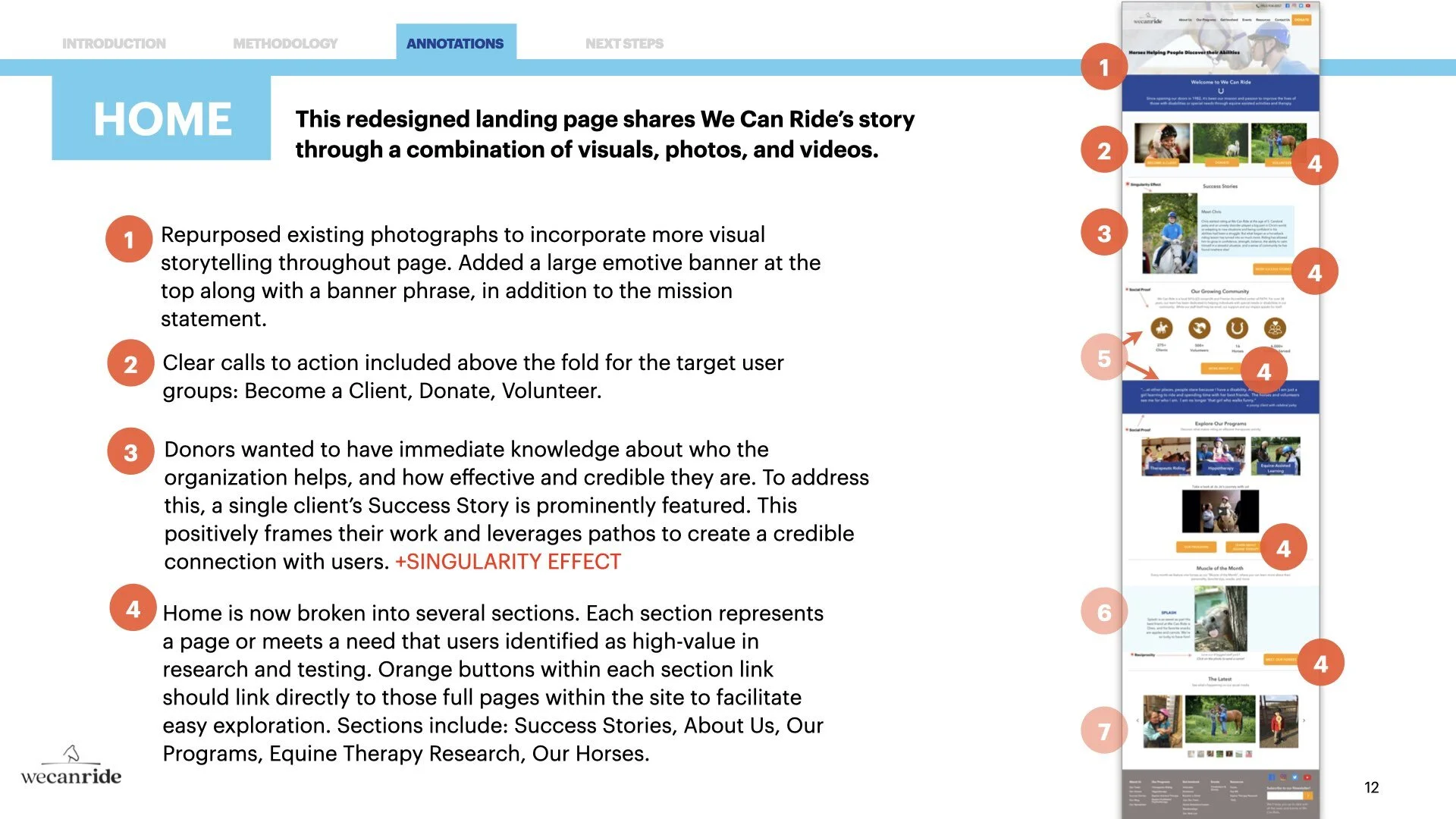
The final prototype contains pages that research showed to be the most high-traffic for both volunteers and donors: Home, About Us, Volunteer, Donations, Get Involved, Equine Therapy Research, Our Horses, Our Programs, and Therapeutic Riding. I included several new spotlight features to give special recognition to their volunteers (“Volunteer Spotlight” for reaching 25+ or 50+ hours), clients (“Success Stories”), and horses (“Muscle of the Month” feature). The headers and footers have been redesigned to be more intuitive and make their content easily discoverable by using the new navigation, listing out the new site map subpages in the footer, and linking directly to their social media in both. Usability testing revealed that users wanted to see more photos, videos, and measurements of We Can Ride’s impact, so the new design has pivoted to tell their impactful story using a variety of multimedia.
I provided We Can Ride with annotated wireframes (see below) explaining my design rationale in detail for each page, along with an interactive prototype to help the design come to life a bit more.
NEXT STEPS
It was an honor to partner with We Can Ride, and I look forward to visiting their site in person to express my gratitude (hopefully soon!).
There is still more to do in the meantime, though. When time permits, my next phase of work for the organization is as follows:
Develop an annual impact report to serve as a centralized location for donors to easily see We Can Ride’s qualitative and quantitative successes each year.
Create annual/bi-annual surveys for distribution among volunteers and donors to create an ongoing practice for receiving feedback and improving their communications.


